Interesting Patterns in BERT and GPT-2 Positional Encodings
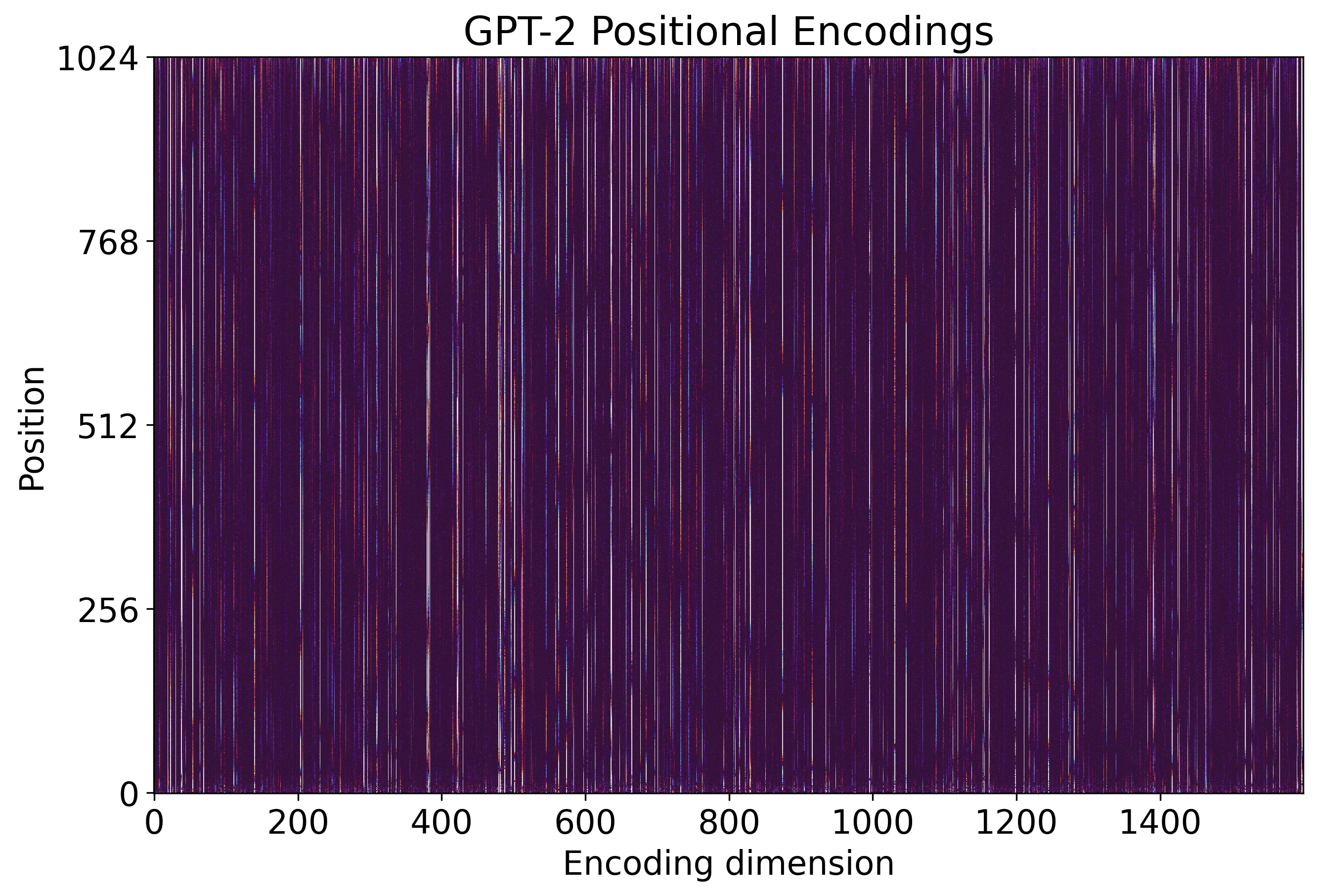
Last month Leandro von Werra posted a short thread on Twitter in which he pointed out an interesting pattern present in BERT positional encodings when compared to GPT-2 encodings. In summary, while visualizing these encodings, he noticed that BERT positional encodings are noisier than their GPT-2 counterpart, specially for positions over 128. You can see this yourself in the two figures below.
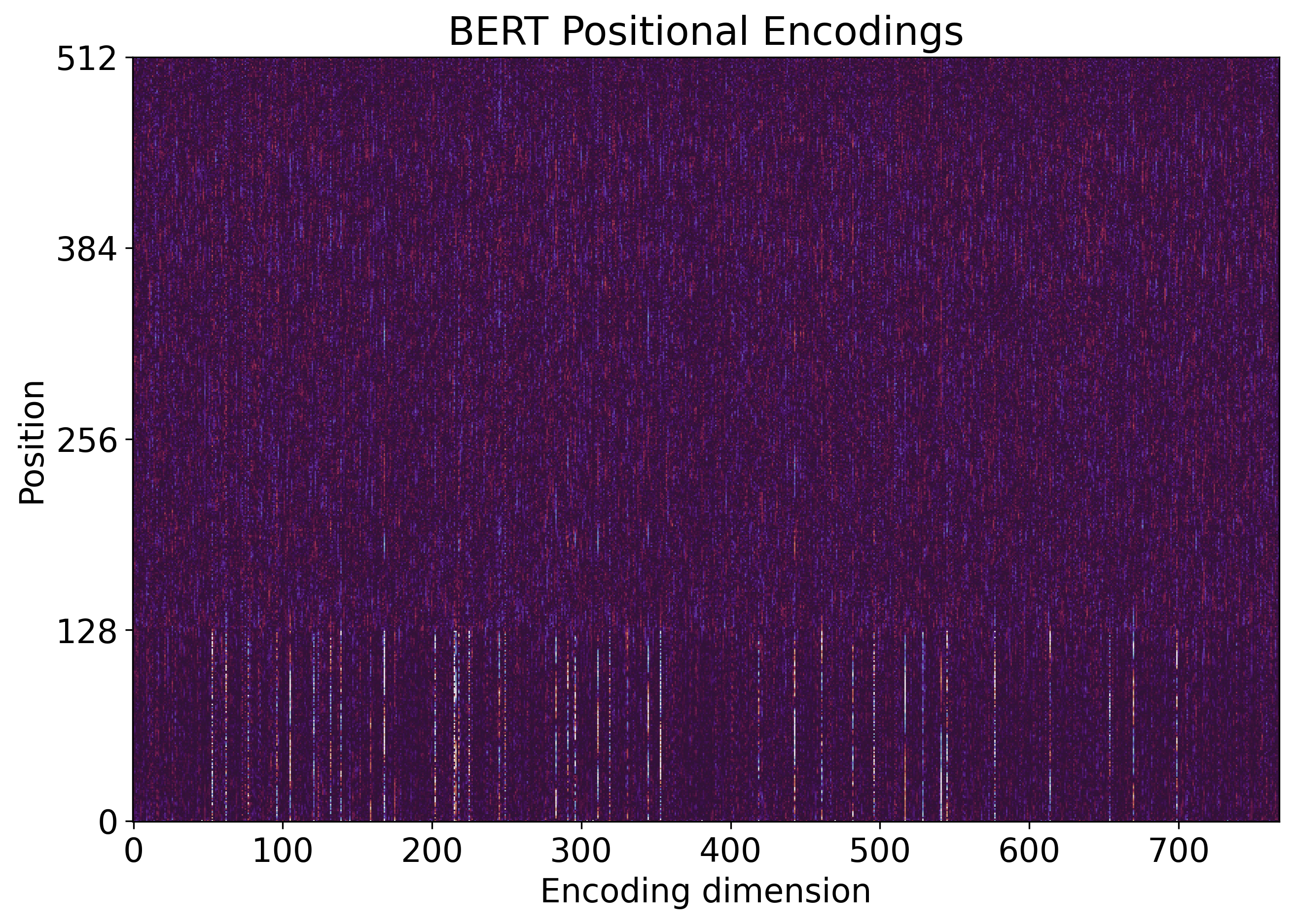
As pointed by von Werra, this makes sense due to BERT pretraining procedure. In Devlin et al., 2019, BERT authors state that 90% of the pretraining steps are performed with 128-token-long sequences:
Longer sequences are disproportionately expensive because attention is quadratic to the sequence length. To speed up pretraining in our experiments, we pre-train the model with sequence length of 128 for 90% of the steps. Then, we train the rest 10% of the steps of sequence of 512 to learn the positional embeddings. – Devlin et al., 2019
Initially, I got interested in von Werra’s thread because I saw an additional pattern not mentioned by him. Then, while trying to create a visualization of this another pattern, I found a few more intricacies of the positional encodings and also von Werra’s visualization. I thus decided to publish this blog post to discuss a bit these aspects. I am also releasing the notebook that I created to reproduce von Werra’s visualizations as well as to present the new ones.
Another Pattern: Active Features
The pattern observed by von Werra indicates that only the first 128 encoding vectors (rows) of BERT are “active”. By active, I mean that these vectors have some values substantially different of zero. In other words, row vectors (positional encodings) at indexes greater than 128 are approximately zero. What I observed is that, on top of that, if we look at the columns (features) of BERT positional encodings, just a few of them seem to be active. I will call these columns active features. One interesting thing is that GPT-2 positional encodings also present sparse active features, very similar to BERT encodings.
If you observe the two figures shown before,
you can notice that many columns are mostly dark (all values close to zero).
However, you need to carefully inspect the figure to make sure of this,
since each column is quite thin.
Moreover, it is virtually impossible to exactly quantify how many columns are active
by only looking at these figures.
Thus, I thought for a while about
how to identify the active features
and how to visualize them.
The best way I thought about was to
sort the columns of the positional encodings
by their norms (2-norm, more specifically).
Observe the following code snippet which uses numpy to do this
(see the notebook for details).
And immediately after you can see the resulting figure for GPT-2.
wpe_gpt_sort_idxs = np.argsort(-np.linalg.norm(wpe_gpt, axis=0))
wpe_gpt_sort = wpe_gpt[:,wpe_gpt_sort_idxs]

We can see that there are approximately 200 active features in GPT-2 positional encodings, However, the features between the 100 and 200 most active features (columns 100-200 in the figure) seem not as active as the first 100 most active features. We also can notice that some features after column 200 seem a bit active. But such specific conclusions can be highly affected by some parameters of the visualization. I discuss this issue in the end of this post.
In the figure below, we can see BERT positional encodings sorted in the same way.
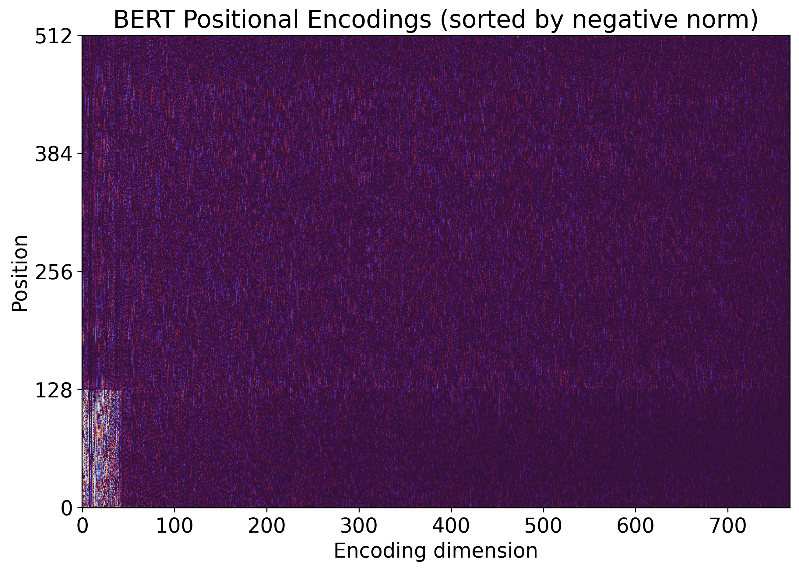
BERT’s positional encodings have way less active features than GPT-2’s. From the figure above, we can estimate that BERT has around 40 active features. We can also see that BERT encodings is indeed noisier than GPT-2 encodings, as pointed by von Werra. Although this sense of noise is also highly affected by some parameters of the visualization.
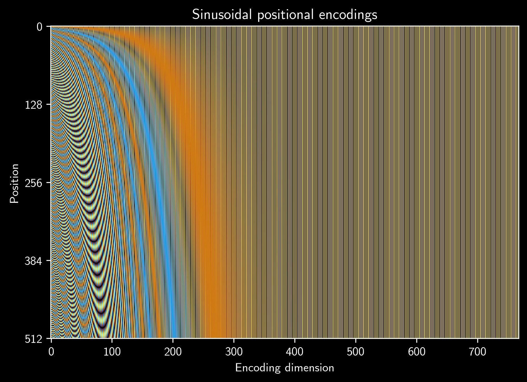
This pattern (sparse features) makes a lot of sense. The positional encodings are summed to other input embeddings (the most important one being token embeddings) in the early layers of both BERT and GPT-2. Thus, it makes sense that the model learns to use just a few features to represent positional information, allowing the remaining features to accommodate information from the other input embeddings.other important Positional information is obviously relevant for most NLP tasks, but tokens are surely more important and richer, thus requiring more embedded features to be well represented. Even the sinusoidal positional encodings, used in the original Transformer paper, present this pattern (see figure below). For me, it is surprising that the number of active features in sinusoidal encodings are also around 200, just like in GPT-2 encodings.
Source: Leandro von Werra's tweet
Visualization of encodings
Visualization is tricky! I think anyone with enough experience on data visualization knows that. Visualization is awesome and can be very insightful, but sometimes it is hard to make it right. And, most important, visualization is always limited, giving just one view of your data.
When using plt.imshow(...) to visualize encodings,
there are at least three important aspects to consider:
interpolation: this should be'none'(not to be confused withNone) in almost all situations. In fact, I cannot think of a case in which we should use a different value here when visualizing encodings (or other data-based/non-natural images). This parameter controls whether some antialiasing technique should be employed, and such techniques are designed to improve the visualizing of natural images. If'none'is specified, no antialiasing is applied, which is desired in the visualization of encodings.cmap: specifies the color map to be used, i.e., the function that maps a value to a color. A color map returns a color for each value within the unity interval[0,1].vminandvmax: specify the range of values that are mapped to the whole color range. The interval [vmin,vmax] is mapped to the unity interval, and then the color map is employed to return a color.
I want to discuss a bit further the two last points mentioned above.
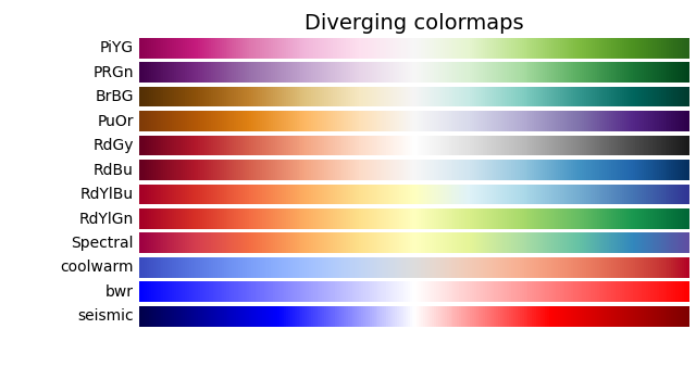
Color map
There are many
available color maps in matplotlib.
Additionally, anyone can
create new color maps
to fit your own needs.
There is a bunch of
theory and principles behind color maps,
and we should be mindful when choosing an appropriate one.
In our case, how can we choose an appropriate color map? One good starting point is to plot the distribution of our data. See below the histograms of GPT-2 and BERT positional encodings.
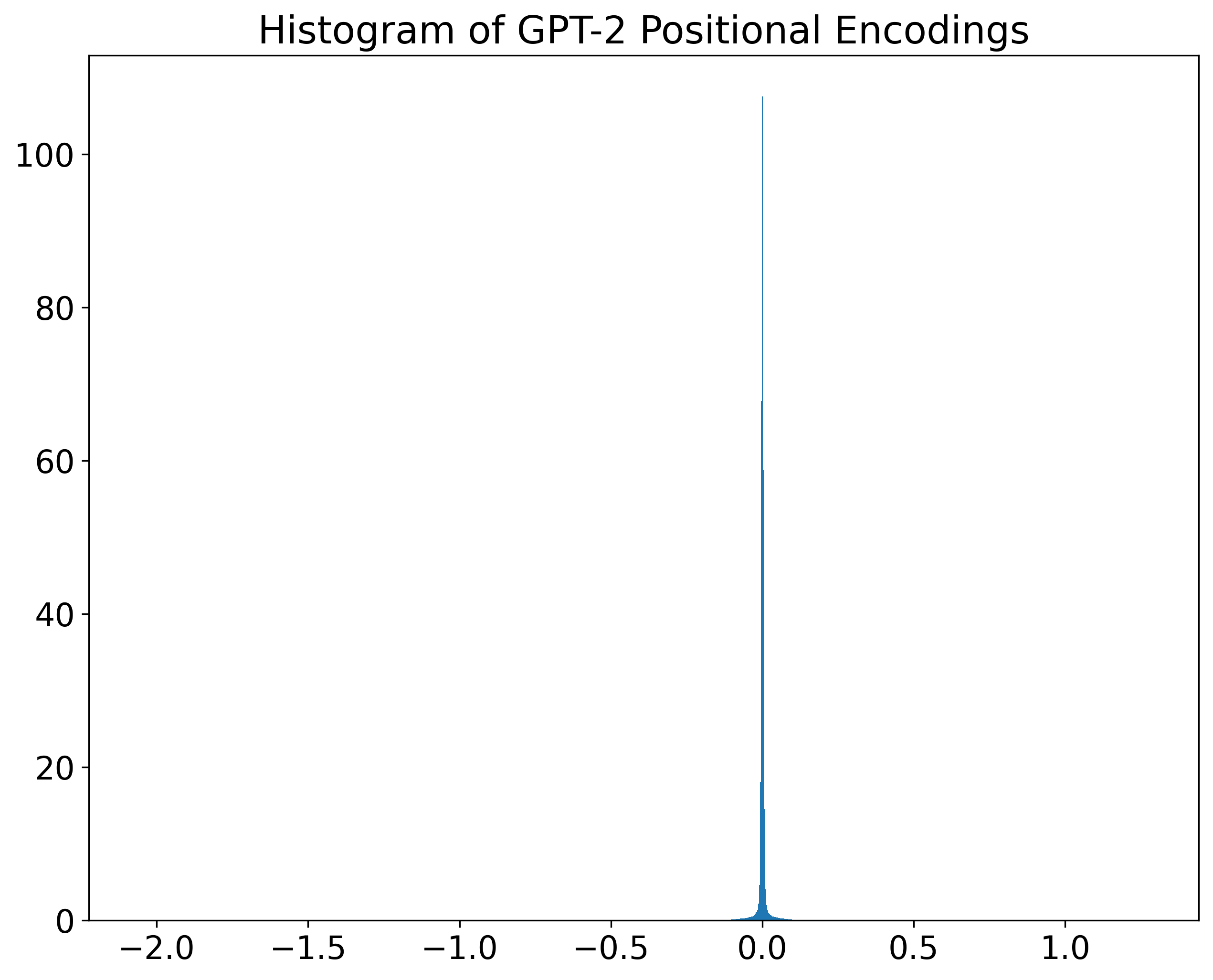
We can see that, in both cases, most values are near zero. At the same time, given that the x-axis limits were set to include the data range, there are values quite far from zero in both encodings. More specifically, the ranges are approximately [-2.06,1.27] and [-0.95,0.73], for GPT-2 and BERT respectively. In such cases, in which values are around zero, diverging color maps are good options.
Source: matplotlib documentation
However, all diverging color maps provided by matplotlib are bright in the middle.
On the other hand, von Werra’s visualizations are dark in the middle
(in our case, the middle should be zero).
And they look pretty cool =).
One color map that gives a result very similar to von Werra’s (maybe he used it himself)
is twilight, a cyclic color map.

Source: matplotlib documentation
This color map is dark around zero and bright towards both ends (negative and positive). In the negative direction, blueish colors are returned. In the positive direction, reddish colors are returned.
Range of values mapped to colors
When using plt.imshow(...), as mentioned above,
the parameters vmin and vmax specify the range of values
that are mapped to the whole color range of the color map.
The color mapping is performed in a two-step procedure.
First, the range of values [vmin,vmax] is linearly mapped to the unity interval [0,1].
Then, each value within [0,1] is mapped to a color based on the used color map.
When a value is specified for vmin,
all values less than or equal to vmin are mapped to 0 (zero) in the first step.
And when a value is specified for vmax,
values greater than or equal to vmax are mapper to 1 (one).
Despite the simplicity of this cropping approach,
it has a high impact on the resulting visualization.
Look at the two figures below (and the code snippet used to create them).
The first figure presents GPT-2 positional encodings using the range [-0.05,0.05],
which is the same used by von Werra.
While the second figure presents the same encodings,
but using a narrower range: [-0.01,0.01].
plt.imshow(wpe_gpt, vmin=-0.05, vmax=0.05, interpolation='none', origin='lower', cmap=cmap)
plt.imshow(wpe_gpt, vmin=-0.01, vmax=0.01, interpolation='none', origin='lower', cmap=cmap)
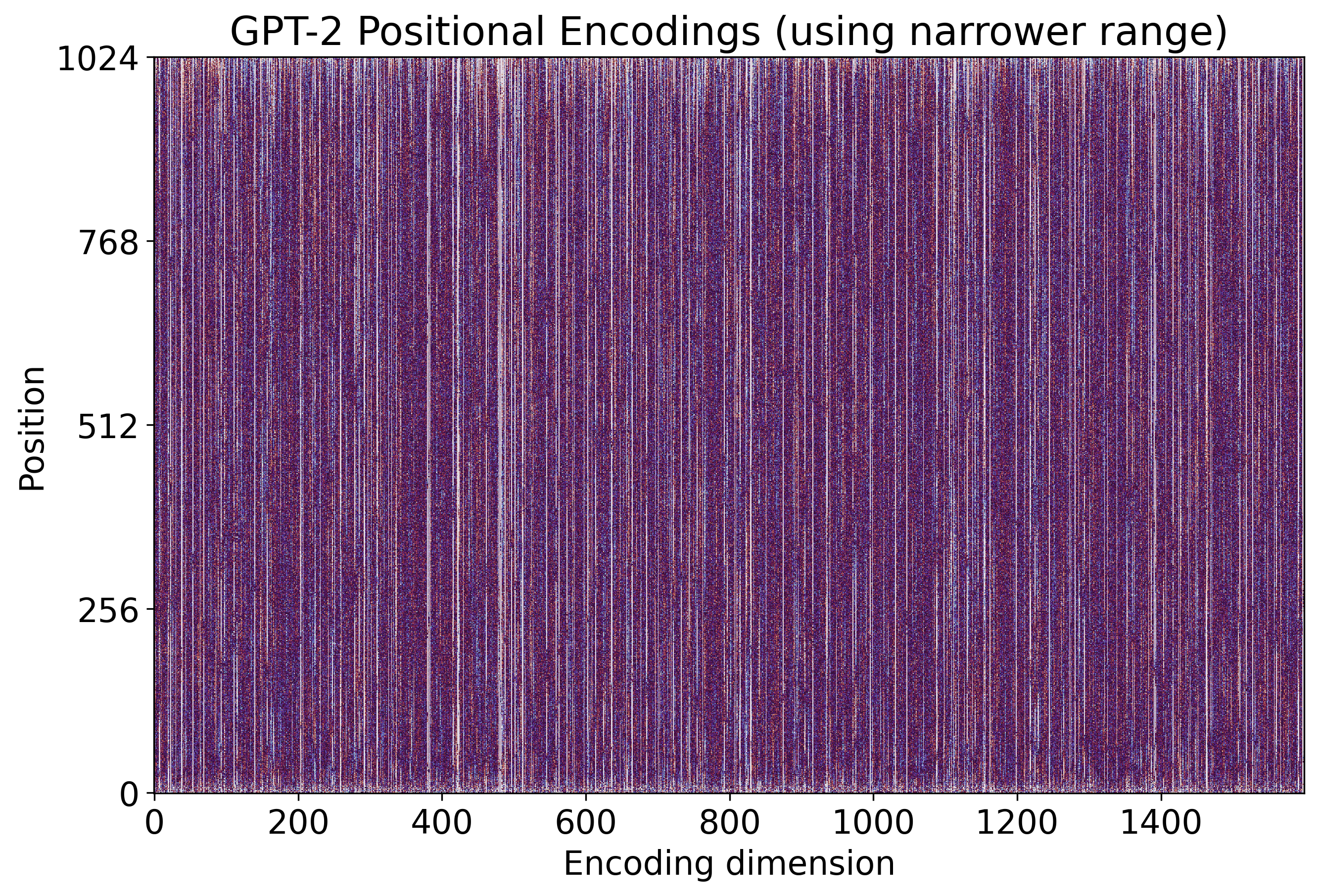
We can see how noisier the second figure looks
when compared to the first one.
But both of them are generated from the same data!
The only difference is the cropping parameters (vmin and vmax).
So, which one is the “correct one”?
That is a hard question
(probably, there is no definitive answer).
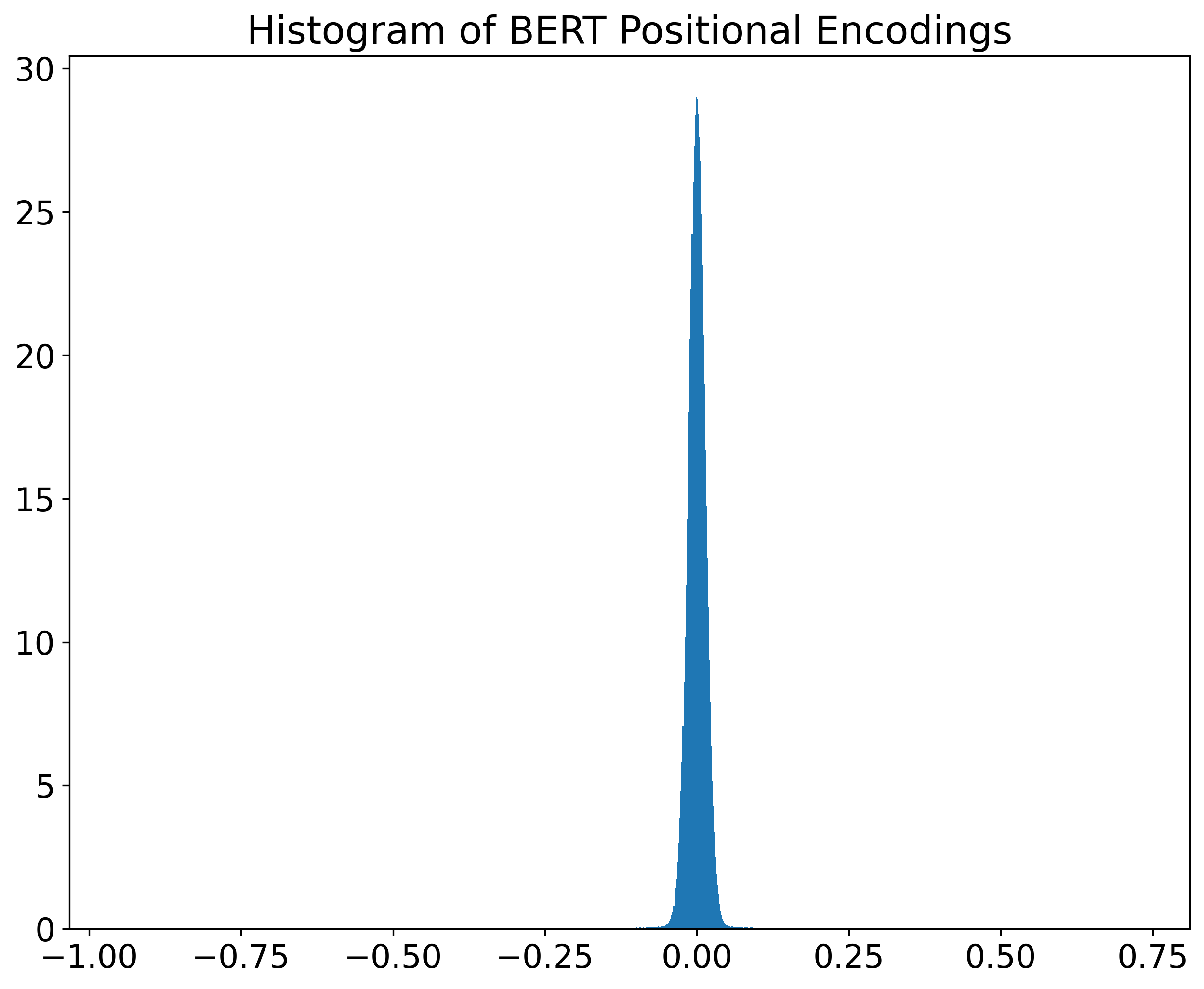
Let us again have a look at the distribution of GPT-2 and BERT encodings. But now let us zoom in the region where most values lie in. In the figure below, both histograms are juxtaposed.
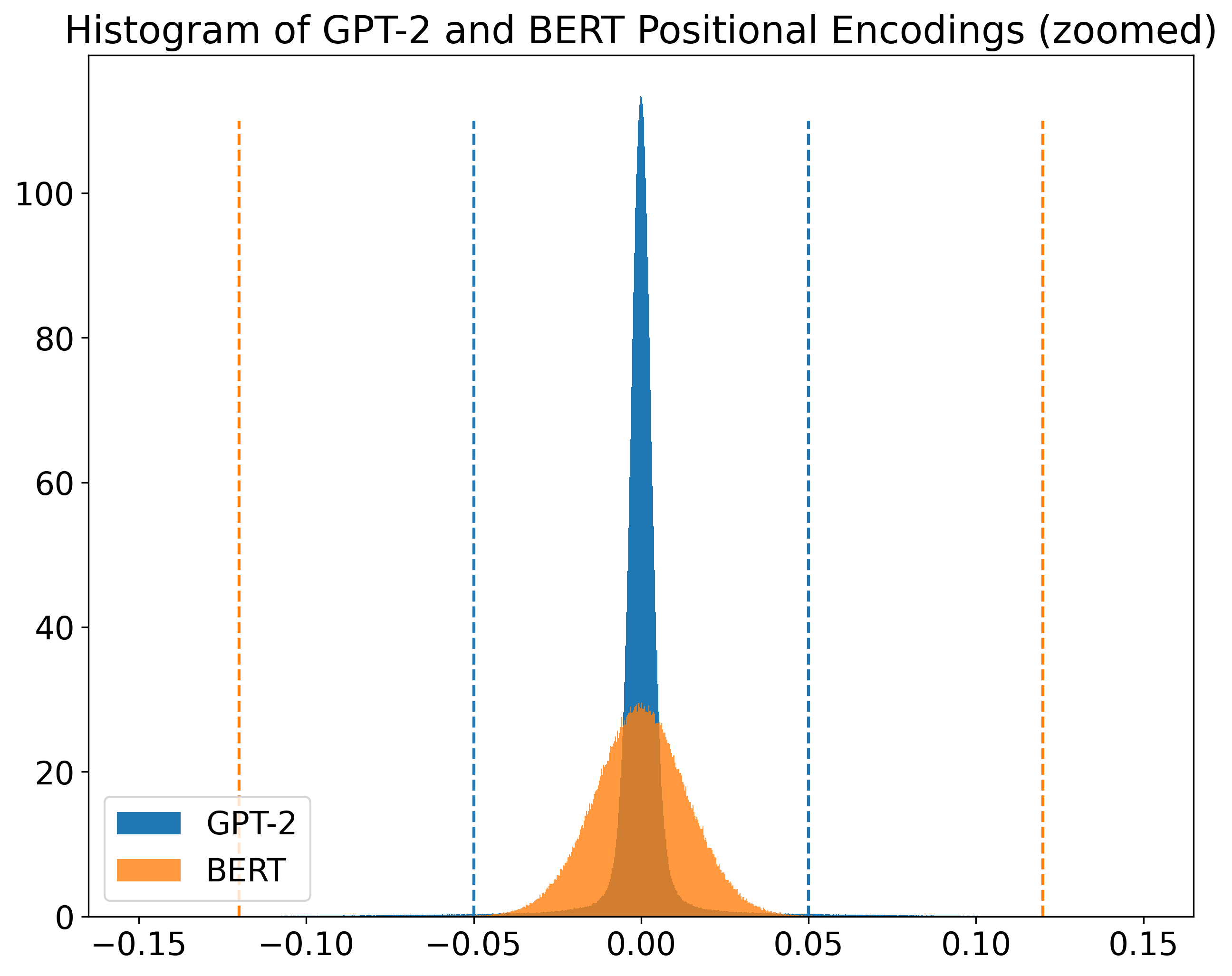
Although both of them have a Gaussian-like shape,
we can see that BERT values are more spread than GPT-2 ones.
Thus, I think it makes sense to use different ranges to visualize these two encodings.
The dashed lines in the figure indicate the values used for vmin and vmax on both cases
([-0.05,0.05] for GPT-2 and [-0.12,0.12] for BERT).
Leandro von Werra, on the other hand, used the same range for both encodings:
[-0.05,0.05].
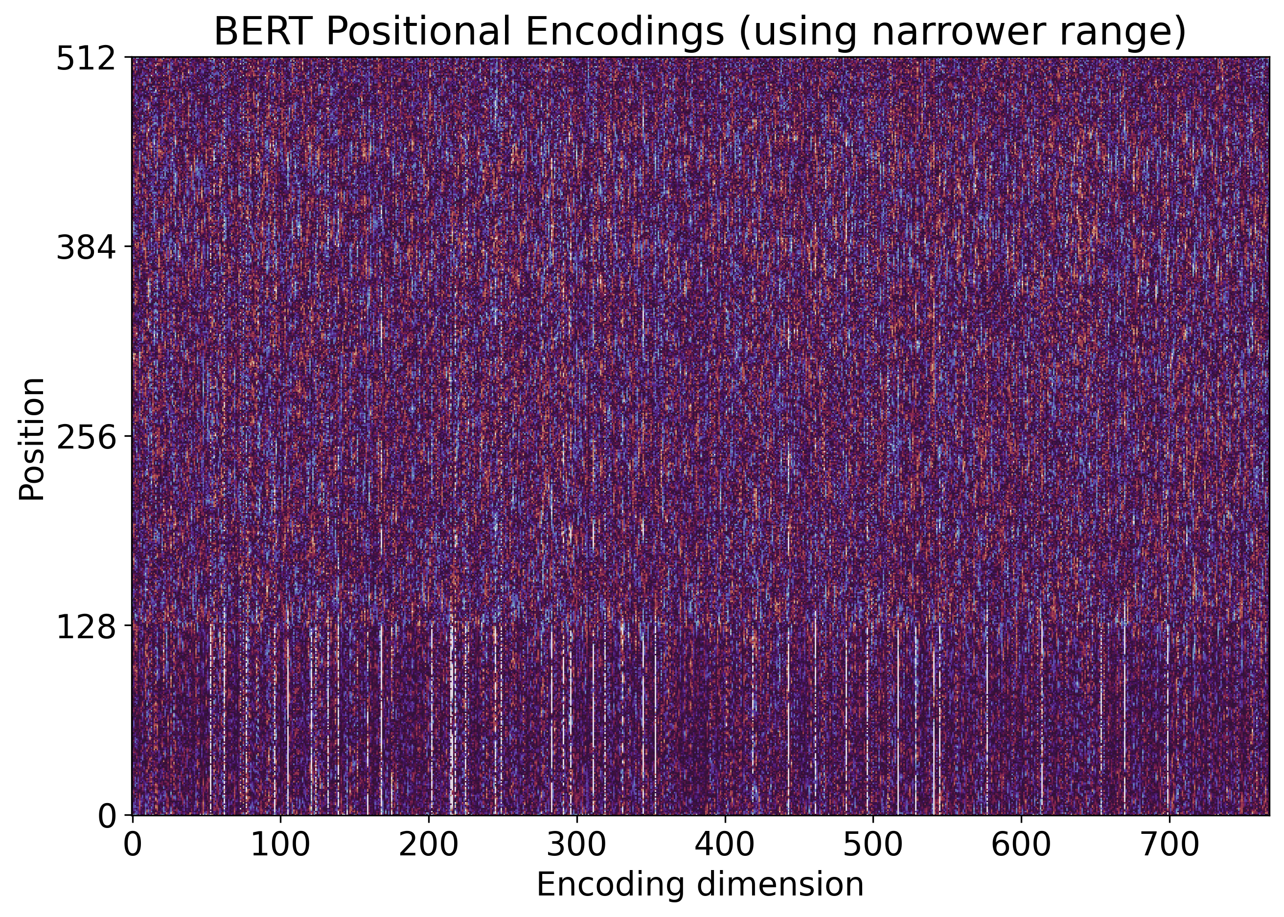
See below two figures generated from BERT positional encodings. The first one was generated using the broader range that I chose according to the histogram above. The second one was generated using the range from von Werra.
plt.imshow(wpe_bert, vmin=-.12, vmax=.12, interpolation="none", origin='lower', cmap=cmap)
plt.imshow(wpe_bert, vmin=-.05, vmax=.05, interpolation="none", origin='lower', cmap=cmap)
As I said before, there is no such thing as the correct range. But I do think that, in this case, it is more informative to use a specific range for each model.
However, everybody should agree on one thing:
the color map range has a high impact on the visualization.
What if we just ignore the range?
In this case, the range is taken from the data,
i.e., vmin=min(X) and vmax=max(X).
And the result is not great, as you can see in the figures below.
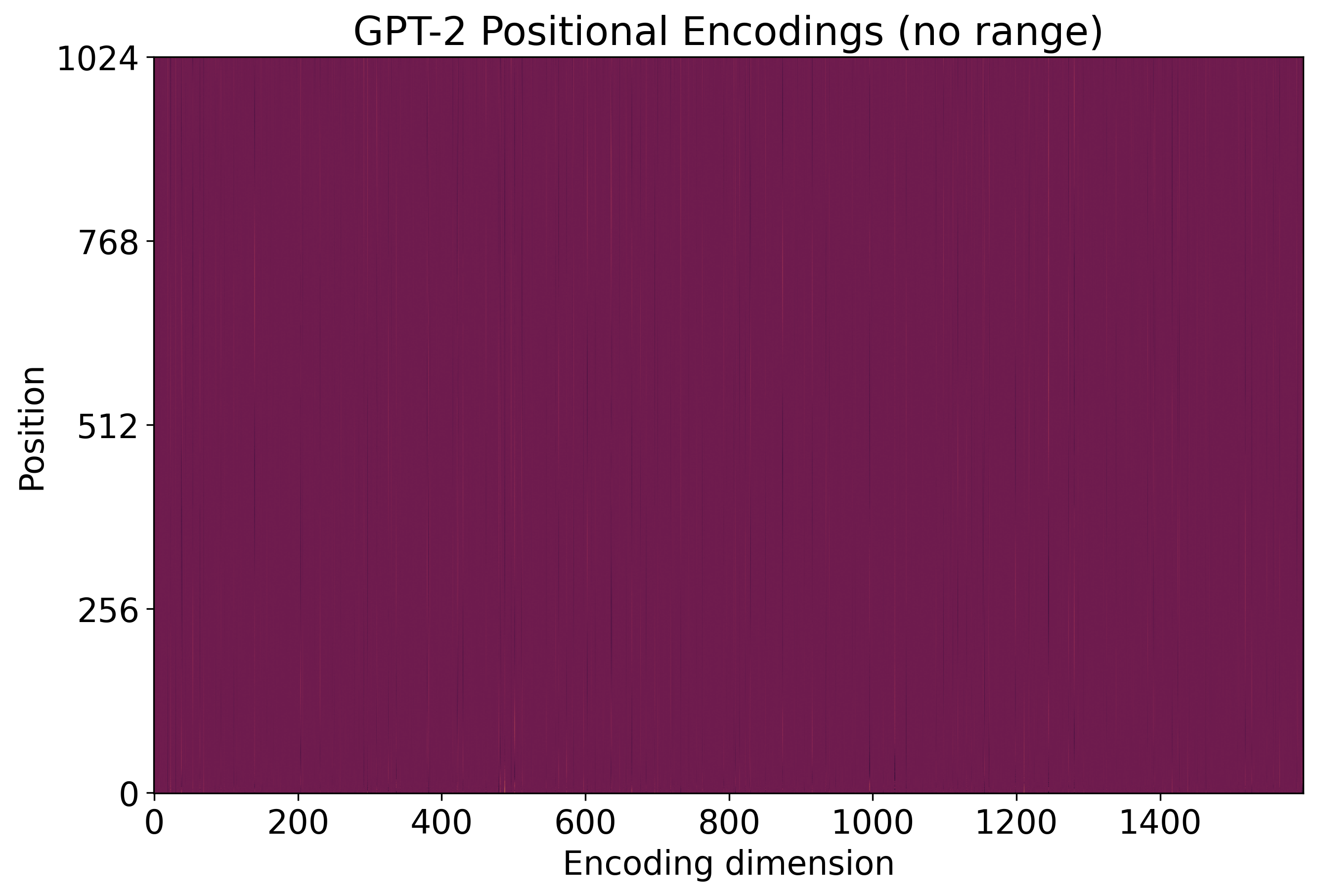
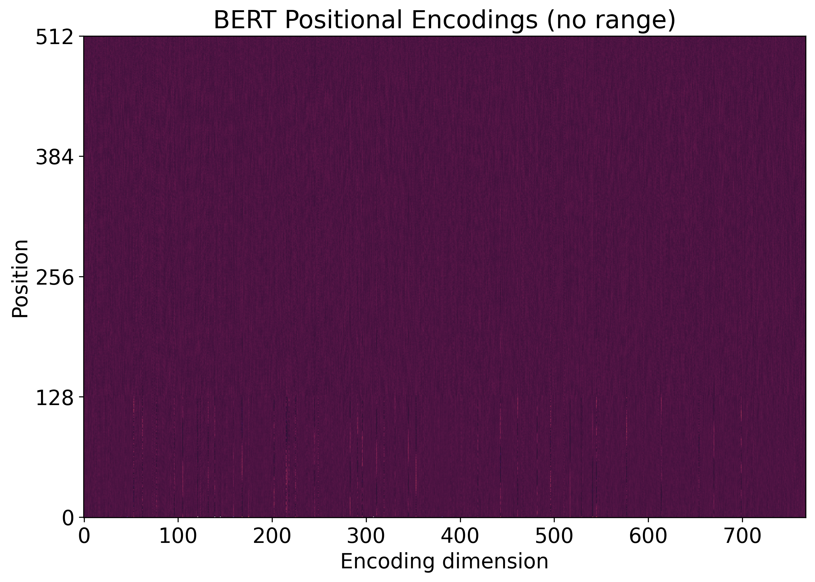
As I said: visualization is tricky!
Closing Remarks
Inspired by von Werra’s Twitter thread, I presented some visualizations that highlight an interesting pattern on GPT-2 and BERT positional encodings. I also discussed some relevant aspects of this kind of visualization, and how some basic parameters have a high impact on the final result.